ShopDreamUp AI ArtDreamUp

Deviation Actions


Suggested Deviants


Suggested Collections


You Might Like…


Featured in Groups


Description
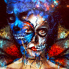
this deviation was made for the contest digital-wings-art.deviantart.c… 
restricted stock


other stock used
fountain ybsilon-stock.deviantart.com/a…
water splash hobbitpunk.deviantart.com/art/…
shinigaminoakui.deviantart.com…
water taeliac-stock.deviantart.com/a…
roses cindysart-stock.deviantart.com…
flower jewel on the hair pranile.deviantart.com/art/15-…
statue amor-fati-stock.deviantart.com…
hair cindysart.deviantart.com/art/H…
sparkles zozziegirl.deviantart.com/art/…
lace www.deviantart.com/art/lace-pn…
jewel on the hair pranile.deviantart.com/art/got…
peacock used for the dress texture maplerose-stock.deviantart.com…
water on the floor fantasystock.deviantart.com/ar…
dress textures jlior.deviantart.com/art/long-…
THANKS FOR ALL FAV AND COMMENTS!!!! XOXOXOOXO
restricted stock
other stock used
fountain ybsilon-stock.deviantart.com/a…
water splash hobbitpunk.deviantart.com/art/…
shinigaminoakui.deviantart.com…
water taeliac-stock.deviantart.com/a…
roses cindysart-stock.deviantart.com…
flower jewel on the hair pranile.deviantart.com/art/15-…
statue amor-fati-stock.deviantart.com…
hair cindysart.deviantart.com/art/H…
sparkles zozziegirl.deviantart.com/art/…
lace www.deviantart.com/art/lace-pn…
jewel on the hair pranile.deviantart.com/art/got…
peacock used for the dress texture maplerose-stock.deviantart.com…
water on the floor fantasystock.deviantart.com/ar…
dress textures jlior.deviantart.com/art/long-…
THANKS FOR ALL FAV AND COMMENTS!!!! XOXOXOOXO
Image size
1536x2048px 3.49 MB
Make
SONY
Model
DSC-S60
Shutter Speed
1/60 second
Aperture
F/3.5
Focal Length
9 mm
ISO Speed
80
Date Taken
Feb 24, 2007, 9:57:16 AM
© 2014 - 2024 Lolita-Artz
Comments121
Join the community to add your comment. Already a deviant? Log In
Hello there
The thumb looked like it was digitally drawn, but nope it was photo manipulationjust saying haha ^_^
Sorry for the late reply tho, I've been very very very busy these days and i hardly find time to draw or comment myself lol :3
So if my comments are lame, forgive me XD (its been a while i last commented on anything but yeah haha)
Alright then, here we goooo![Adorable Girl Anime Emoji (Lovely Mode) [V6]](https://fc01.deviantart.net/fs70/f/2014/283/4/6/46eb58d95f8e5864377a64c57d68326f-d7nofx8.gif)
First of all, i wanna start with the overall picture,
You applied many many pics here, and it was hard for me to go through all of them, so ill give a general overview.
I like your manipulation technique, its quite nice i gotta say and the pic overall is very lovely

But what i would suggest changing a bit are the color shades, that's the main thing i would suggest fixing. The problem is that the shades are too bright and little or no shadows are seen. In this picture it seems that the light is coming from the top left, so there should be a shadow of each part along the same angle.Note that there should be a shadow on the rock, and the angel behind. Moreover if you want to highlight the angel, you would want to make the background a bit darker, so that she is a bit more visible. That would make it look a little more realistic. The angel is beautiful indeed, and she has a sad but lovely expression, but note how the shades are uniform, her face is more brighter than her right arm, which is brighter than her left arm. You would want to give her an uniform skin color if you can to make her more gorgeous. Also note the rocks on the top left from where the light is supposedly coming. The texture of those rocks became almost invisible because of applying too much light, and the rock on the top middle doesn't blend properly. It looks like two different rocks were from two different places and origin were just forcibly attached. What you can do is, get the texture properly first, and then apply the light shades, and shadows on the cracks (if any) and then put the fountain and thin its light shades and dark shades. Its like this. Step 1: Apply a body/object which has a good texture. Step 2, apply the dark shadow and light shades and complete the pic till that. Step 3: Then apply another body and repeat step 2 and so on. Your first object should be the garden/forest, second would be the rocks, third should be the fountain and the last one should be the angel. Also the color shades in the garden pic doesn't really fit with the original pic, but hang on, ill write about that in another paragraph ^_^. Also try applying a little bit of contrast and sharpness to create an actual depth in the picture. That will change the perspective totally and make it look less imaginary. There goes the shades shadows and contrast part.


Next comes the background outer rocky layer. (the border of the garden and the rock).
I like the idea you wanted to put there, and it would look really nice. But the rocks itself lacks depth. It looks like a 2 dimension instead of 3D, which makes the rock look like its a paper wall instead of real rock. If you can give it a sight little depth it would be really nice, it can be from 1 millimeter to 3 millimeter or more depending on what you feel better, but it needs a little depth to make it look more rocky and realistic .

Third comes the flowers, in the garden background. (around the center of the pic).
Apart from the shades part which i discussed earlier, the garden doesn't really fit in for some other reasons too.
I think i could see the clear blue skies between those leafs? yeah those normally should not be there in that way (according to the angle of the overall pic itself). And the colors of the flowers and leafs are a bit blurry, (dunno if that was your intention) and you can try to make them look a bit more sharper.

Well, rather than choosing a garden pic in a rocky place like that, i would suggest applying a forest pic in it, or forest flowers etc. Garden pics might also do the trick but you gotta get rid of the skies, and make the pic look more sharper. Also, notice how the actual fountain got a little blurry on the boundary of the flowers and itself? Yeah, you need to make the fountain boundary (and many other boundary) sharper, and not blurry. It's okay to make far away objects a bit blurry, but the fountain is too near. Plus even if you make a distant object blurry, the boundary needs to be sharp, otherwise the whole image looks blurry. To blur an other image sometimes means to highlight another object, but here you blurred the boundary of the object itself which you should avoid if you want the picture to look more realistic.
Next i wanna say about the fountain and the fountain statue.
Like said before the fountain statue blurs out and mixes with the stones (pictures) behind it. Take an object (any object) in your hand now, do you see the boundary blur or fade out mixing with your hand? I think not. Same should be applied while making an art, unless you want to camouflage something, which in this art you are not. The fountain statue itself looks stunning, and the texture grains are okay, but it could again be improved by fixing the contrast and shades of it.
The fountain itself seems to be floating in the air with no support, (unless i am missing something). It should be okay if you wanted to give it a fantasy look to it, but if you wanna make it realistic then the fountain should be supported somewhere so as it doesn't seem like floating. Objects as heavy as that doesn't just float around like that in real life, but in fantasy it can be considered okay.
The water dripping down from the fountain is okay, and the water layer beneath the fountain was well shaded, i give you that. But the water splashes on the water level are somewhat a bit off. You see water drops as tiny like that shouldn't have a water splash effect that big, unless you are taking a macro pic, but in this case you are not. I suggest you to decrease the water splash to the size of the droplets.
Plus the rock behind the fountain is a bit off too. If you were trying to make that rock as the base supporting the fountain, then the water drops shouldn't fall straight, it should flow along the rock.Here the water drops seems to penetrate the rocks as they fall. If you wanted to make the fountain stand out from the rock, then the rock should have had the shadow of the fountain itself. But here in this picture you have done neither of it. So to improve the pic, you gotta apple one of the said effects above. The water circle just below the fountain is okay, you can keep it if you want, bit you might wanna blend the water splash a bit more so that it looks more pleasing. Just decrease the water splash circle a bit too (horizontally) and that would definitely do the trickThe blending here could be a little hard but hey! practice makes things perfect right?
The gradient of the water just above "cit" of the word "chicitac" could be a little smoother, but it's all okay. It looks fine to me either way
The tree which links both the water and the angel somewhat okay, but again the boundary of the tree and the water blurs out. Also it looks as if the tree was cut and attached there, because it lacks a well visible smooth edge. The shades falling to the tree can be considered okay but you need to fix the boundary to make it look more visible. Below the tree, there are some plants, leafs, branches etc etc, which seem to be coming out from nowhere, because the water level drops or stops where the tree is. Water would flow there making half of the area submerge under it such that the plants and branches wouldn't be so visible. There's an old expression, "water seeks its level." The physics behind water's tendency to flow until all of it is at the same level is related to potential energy— energy stored in forces such as those of gravity. The higher water is, the more gravitational potential energy it has. Water, like everything else, accelerates in whatever direction reduces its total potential energy as quickly as possible. Open water always accelerates so as to level itself. So here you gotta level the water properly to give it a natural look
Last of all i wanna comment on the angel.
She is lovely and gorgeous, no doubt on that
But still there are little flaws in it, which if changed could make her perfect. What's confusing about her is that i don't know if she is standing (which shouldn't be because i cant see her legs), or she is sitting (which is still okay, but her dress says she is standing but she is not). The head and the shoulders are slightly off because of the angle we are seeing the picture. If she was sitting somewhere low and a bit far away, and looking up,it would look fine, but here the angle is straight and thus her neck looks non existent, and the head and the shoulders seems to be attached to a different body of her own. The hair here looks like she is wearing a wig, but i guess that can be adjusted automatically if you can adjust the head and shoulder to the body. Her right hand seems to be a bit cut off, and her right arm, for some reason is more bright than her left arm, which you might wanna change. Her dress is well done, and i have no problems with that, and it has a lovely color

Over all the picture looks stunning, and you did it very well, i just pointed out a few flaws just so that you can improve your work in future and make almost perfect arts. From the picture alone i could see how much effort you gave to make it look good, and i really appreciate it. I am sure you will continue to practice more and more with the same effort and improve
Keep up the good work
Feed backs are always appreciated.


![Neko Emoji-42 - (Kawaii Admiring) [V3]](https://fc00.deviantart.net/fs70/f/2014/303/f/1/f1001a42ea556ce7353d3cde8ed7106a-d84m1ve.gif)
